Monday, May 08, 2017

French Presidential Election Maps


77 years after being invaded by Nazi Germany over one third of votes cast in a French Presidential election went to a fascist.

We have to ask ... 'why'?

Results of the French presidential election reveal the same geographical split which emerged in the first round vote for the president. This geographical split reveals that Le Pen is most popular in the north-east of France and along the Mediterranean coast. Comparatively she has far less support in the rest of the country.

The Guardian and the Financial Times both have presidential election maps showing how France voted in yesterday's election. The Guardian has mapped the majority for Macron and Le Pen in each department. The FT map has broken the results down further and shows the percentage of votes cast for Macron and Le Pen by commune. Both maps reveal the same geographical split in Le Pen's popularity. As the Guardian reports Le Pen's heartland is in "the rust belt bordering Belgium and along the Mediterranean coast".

The New York Times has begun to analyse why these two areas of France might be attracted by a candidate of the far right. The paper uses two maps to compare votes for Le Pen with the 2016 unemployment rate. There certainly seems to be a strong correlation between the rate of unemployment in a department and the number of votes cast for Le Pen.

However, even though Le Pen's strongest support was in the north and south, the New York Times points out that Macron was still the most popular candidate in 'most demographic groups', including in places with high unemployment. According to the Financial Times unemployment isn't the strongest predictor of the Le Pen vote. In fact unemployed voters in urban areas were not significant voters for Le Pen.

The Financial Times has identified educational levels and social class as the strongest predictors of Le Pen voters. Macron's vote share nationally was highest in areas with few working class jobs. The strongest indication for an area voting for Le Pen was education. Le Pen 'gained most votes in areas where the level of education was relatively low'.

If you are interested in exploring the votes further then the NYT's main French Presidential election map is a good place to start. The map shows the results by commune. You can also mouse-over a department area on the map to view a breakdown of the votes by candidate and the percentage of the electorate who voted. The map also includes a number of annotations highlighting interesting areas in France where Macron or Le Pen have above average support.

Saturday, May 06, 2017

Stress Free Bike Maps


Montgomery County in Maryland has created a stress frees route planner for cyclists. The Bikeway Stress Levels map shows you the most and least stressful streets for cycling in the county. It can also plan a route for you that avoids the most stressful roads.

To create the map the Montgomery County Planning Department rated every single road in the county based on how stressful it is for cyclists. The ratings are based on attributes like "traffic speed, traffic volume, number of lanes, frequency of parking turnover, ease of intersection crossings and other characteristics".

The Bikeway Stress Levels interactive map shows the stress rating for each road by simply coloring each road on the map by its assigned stress rating. If you select a road on the map you can view details about the road, such as the number of traffic lanes, the speed limit, whether there is on-street parking or whether there is a bike lane.


Montgomery County's approach is very labor intensive. To assign a stress level to every road in the county the Planning Department assessed each road on Google Maps Street View and visited many of the roads in person.

A quicker but less accurate method for assigning a cycling 'stress' or 'safety' rating to roads is to use Open Street Map tags. Mapzen's Bike Map does exactly this to help you navigate the safest way to cycle. The Mapzen Bike Map colors roads and bike paths based on three different tiers of safety, allowing you to tell at a glance which roads are the safest for cyclists.

The three tiers are:
  • Green (safest) - off road bike paths
  • Orange (less safe) - on road bike lanes
  • Blue (least safe) - no bike lanes
The Bike Map uses data from Open Street Map. This means that the map works for anywhere in the world. It also means that if you don't think the map is accurate enough in your area you can improve the map by contributing to Open Street Map.

If you want to use the Bike Map in your own maps you can! You just need to add the Walkabout basemap style to a Tangram map and turn on the bike tier data. The Mapzen Blog has more details on how to use the Bike Map layer in your own maps. It also has more details on how the map was designed and the other biking features that you can find on the Bike Map basemap.

Friday, May 05, 2017

May the Fourth Be With You!


A long time ago, in a galaxy far, far away ... there was a map.

The Star Wars Galaxy is a huge 3d WebGL map of the entire fictional galaxy from George Lucas' series of Star Wars films. The map includes 3d models of all the planets, moons and death stars that feature in the popular movies.

When the map loads you should press the play button in the bottom left-hand corner of the map to set out on a tour of the whole galaxy and the major planets. You can also navigate to individual planets using the menu that runs along the bottom of the map. If you get lost in your travels around the galaxy you can use the search option to search for individual planets (or even the Death Star) by name.


You can also explore the Star Wars Galaxy on a more conventional 2d map. The Star Wars Galaxy Map is a two dimensional interactive atlas of a galaxy far, far away. You may have heard of the legendary battles between the Empire and the Rebel Alliance. Now for the first time you can explore the famous locations in this epic galactic war.

The map shows the location of planets, sectors and regions within the Star Wars Galaxy. You can click on regions and planets to reveal their names and a link to the relevant Wookieepedia article. You can also select which layers you want to see displayed on the map by clicking on the 'visible layers' button.


You don't have to travel to the Star Wars Galaxy to feel the force. May the Fourth Be With You is a fun Mapbox GL map which appears to have turned the Earth into a frightening Death Star.

This clever map uses an animated star field image as the map's background. This makes it appear like the Earth's cities are floating in space. An effect which is enhanced by the animated TIE Fighters flying over the 3d buildings on the map.

Thursday, May 04, 2017

Global Real-Time Animated Transit Maps


There are lots of localized transit maps which show the real-time location of buses, trains and other modes of transport in towns and cities around the world. Travic, on the other hand, has always had global ambitions. The Travic map provides animated maps of over 700 transit systems around the world.

Livemap24 has similar global ambitions. Using Livemap24 you can zoom-in on locations around the world and view local transit systems moving around the map in real-time. I haven't tested every country on Livemap24 but it looks like it shows real-time transit in most 'first world' countries and has patchy or no coverage in non-first world countries.

The number of transit systems shown on the map seems to be good in most countries, except the UK. For example in New York you can view live buses, subway cars and trains. In Berlin Livemap24 shows the real-time movements of trams, buses and trains. In Sydney it shows ferries, buses and trains. In the UK however Livemap24 only seems to show the real-time location of trains.

One very neat feature of Livemap24 is that you can click on individual vehicles moving on the map -to view the vehicle's complete schedule, with all planned times and stops.

Medieval Digital Maps


The Oxford Outremer Map is a thirteenth-century map of Israel and Palestine. The map also encompasses parts of modern day Syria, Turkey, Lebanon, Egypt and Jordan. The map seems to depict the region sometime between 1229 and 1244, when Christians had control of Jerusalem. The map itself was probably built to aide European pilgrims to Jerusalem.

The Fordham Medieval Digital Projects has created an interactive version of the Oxford Outremer Map. The digital version of the map includes interactive place-names. If you click on a place-name on the map you can read a translation, a brief description and a link to view this location on a modern digital map.

You can read more about the Oxford Outremer Map and how it was digitized on the Fordham Medieval Digital Projects website.


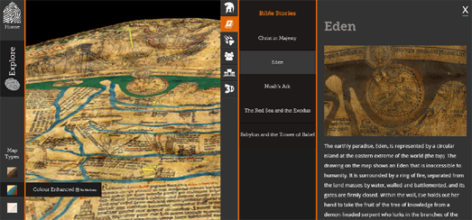
The Hereford Mappa Mundi is the largest surviving medieval map of the world. The map is on display in Hereford Cathedral, UK. If you can't get to Hereford to view the map in person you can at least view the map online. Mappa Muni allows you to explore and examine the details of the map in a well designed interactive presentation.

The online version of the map includes a color enhanced view and a 3d Scan Factum view. The 3d view includes some interesting information about the vellum used to create the map and reveals important facts about how the map was created and where patch repairs to the map have been made over the centuries.

The online Mappa Mundi includes a number of map markers that allow the viewer to explore locations on the map in detail. Jerusalem is at the center of the map and East is at the top. If you select any of the markers you can view a close-up of the location and read about some of the cities, people, beasts and myths depicted on the map.


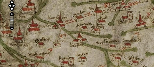
The Gough Map or Bodleian Map is the oldest surviving route map of Great Britain. The map probably dates back to the 14th or 15th centuries.

There is some debate over the age of the Gough Map and Linguistic Geographies has been attempting to answer the question of who made the map & when by examining the language and place-names used on the map. Their research of the map's language suggests that some of the map’s writing dates to around the 1370s. The research also found evidence that some of the place-names on the map have been overwritten at later dates.

You can examine the map and the map's language yourself in close detail on The Linguistic Geographies digital version of the map.

Tuesday, May 02, 2017

Changes to the Black Marble


NASA's new composite satellite map of the Earth shows the distribution of artificial lights around the world. The so called 'Black Marble' map of the Earth is made up of the best cloud-free satellite images of each land mass captured during 2016.

The new Black Marble map can also be compared with the last major satellite map that was created to show the Earth at night, released by NASA in 2012. By comparing the two maps it is possible to see where lights have been going on and off around the globe in the last five years.

If you want you can view the new Black Marble map on NASA's Worldview interactive map. Alternatively you can compare the 2012 and 2016 Black Marble maps side-by-side on the Black Marble: 2012 vs 2016 interactive map. This map allows you to swipe between the two NASA maps and compare the changing scale of natural lighting around the world. For example, if you open the map using the link above you can clearly see the effect that the Syrian war has had on electricity supply in the country.

John Nelson has also compared NASA's 2012 and 2016 Black Marble maps to see where in the world lights have been going on and off. His Lights On & Lights Out map highlights the locations around the world where there have been significant changes in electric lighting since 2012.

Nelson points out in the text accompanying the map that there are many reasons why places might show an increase or decrease in electric lighting. The increase in India is due to the "massive electrification of northern India in recent years". Elsewhere reductions in night lighting may be due (among other reasons) to attempts to reduce light pollution.

Make Your Own Animated Wind Map


Earth Nullschool is one of the greatest interactive maps of all time. It is both an awesome technical achievement and a beautiful visualization of worldwide weather. Now you too can create your own global interactive animated wind map.

WebGL Wind is a plug-in library for Mapbox GL which can create an animated mapped visualization of wind conditions around the world. The map uses wind data from the European Centre for Medium-Range Weather Forecasts. It renders this global wind data as 1 million animated points at 60fps on top of a Mapbox powered map.

The Demo Map of WebGL Wind includes controls to adjust the number of wind particles used and the speed at which they are animated on the map.

How Well Traveled Are You?


Have you traveled as much of the world as the Queen of England? My guess is that unless you have a commonwealth of countries and a massive royal yacht then the answer is "Probably not!".

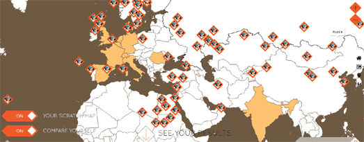
You can find out with the How Adventurous Are You? interactive scratch map. Just click on all of the countries that you have visited around the world and the scratch map will reveal how much of the world that you have seen. What's more you can then discover how well traveled you are compared to a number of well known celebrities.

The range of celebrities that you can compare your travels against have a distinct British flavor. As well as Queen Elizabeth you can compete against David Attenborough, Micheal Palin, Bear Grylls, Karl Pilkington and some other people that you've probably never heard of, like Pope John Paul II.

Monday, May 01, 2017

The Global Atlas of World Trade


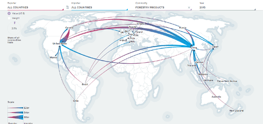
You can now explore how trade operates around the world on a new global resource trade database, which includes 20 million points of data on global trade spanning 270 countries and 1,300 commodities since 2000. The online database also allows you to map the trade flow of individual commodities around the world.

Using Chatham House's resourcetrade.earth you can track and visualize how natural resources are traded around the world. resourcetrade.earth's interactive mapped interface allows you to view the global trade of individual commodities, the global trade of individual countries and how trade by these countries in all these commodities has changed over the years.

For example using the map's filter controls you could visualize all the countries where the USA imports sugar from. As well as the map showing the countries that export sugar to the USA resourcetrade.earth shows the total value of trade from each of these countries and information about the fasting growing and fastest declining countries in the trade of sugar to the USA. You can also then progress to view information and the value of the international trade of sugar and explore where other countries around the world import or export sugar to and from.

Searches carried out using resourcetrade.earth can be visualized, shared, embeddeded or downloaded. This means that you can use resourcetrade.earth to illustrate reports and stories about individual commodities and global trade on your own website or blog. Chatham House uses this feature of resourcetrade.earth themselves to illustrate and visualize their own investigations into the international trade of natural resources. You can read these investigations in resourcetrade.earth Stories.

The resourcetrade.earth interactive data visualization tool was developed for Chatham House by Applied Works.

Mapping Borneo's Deforestation Disaster


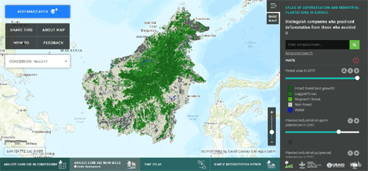
In 1973 three quarters of Borneo was covered in tropical forest. Since 1973 over one third of that forest has been lost due to industrial logging and the spread of industrial oil palm and pulpwood plantations. The Atlas of Deforestation and Industrial Plantations in Borneo shows where Borneo's tropical forests have been lost and the incredible scale of this continuing deforestation.

The interactive map includes three main layers. One layer shows the 2015 area of forest cover. A second layer shows industrial oil-palm plantations. The third layer visualizes industrial pulpwood plantations. If you use the menu at the bottom of the map the 'Simple Deforestation Layer' allows you to swipe between maps showing forest cover in 1973 and in 2015. Another option in this menu lets you view industrial plantations based on how much time elapsed between deforestation and their establishment.


It isn't just Borneo which is facing this scale of environmental destruction. The world's largest producer of palm oil is Indonesia. To grow oil palms vast areas of tropical forest in Malaysia and Indonesia have been destroyed.

Greenpeace has responded to this environmental disaster by creating an interactive map to provide information on company concession information and how these concessions relate to peatlands, fire hotspots and deforestation alerts in Indonesia.

The Protecting Forests & Peatlands in Indonesia map includes a number of data layers which allow you to view where palm oil, wood fibre, logging and coal mining concessions have been awarded in Indonesia. You can click on the concession areas on the map to learn more about the company that holds the concession and the size of the concession. The map also includes layers which allow you to view orangutan & tiger habitats, forestry land cover and peat lands. The map can also show active fires in the country and fires since 2013.


If you want to learn more about why forests are being lost to palm oil plantations then you should take a look at the Guardian's From Rainforest to Your Cupboard: The Real Story of Palm Oil. This interactive study explores the environmental impact of the increasing production and use of palm oil around the world.

One of the biggest disasters caused by the increase in palm oil consumption is the destruction of the rainforests in order to create palm oil plantations. The Guardian illustrates the effect of this deforestation in Indonesia with a before and after interactive map using satellite imagery showing primary forest loss in the Riau province of Indonesia between 2000 and 2012.

The Guardian has also created a timeline map to visualize the global increase in palm oil production. This map illustrates the growth in global palm oil production over the last 50 years. A similar timeline map is used to show the growth in palm oil consumption in countries across the world over the same 50 year time span.